BRanding
Flixbus
Branding Flixbus
Following the merger of FlixBus and MeinFernbus in 2015, I was commissioned to create a unified brand identity capable of supporting the company’s ambitious international growth plans.
The challenge was to merge two established brands with different visual identities into one coherent and scalable system. Rather than starting from scratch, my approach focused on combining the strongest elements of both brands while establishing a clear long-term direction for the future of Flix.
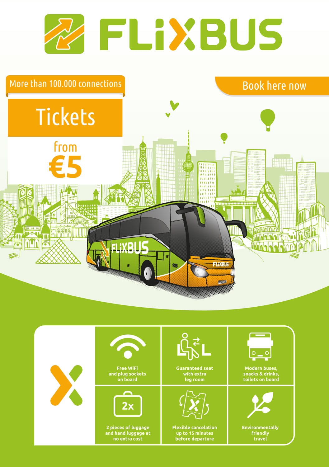
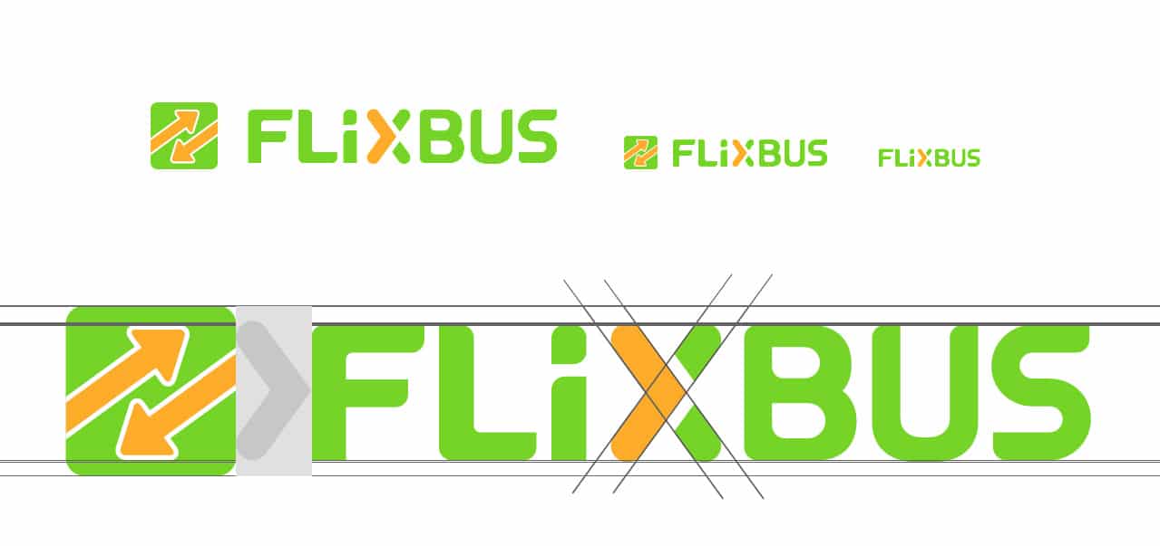
A key strategic decision was to strengthen the Flix brand by making green the primary brand colour and gradually moving away from the orange heritage of MeinFernbus. The existing arrow symbols were replaced by a more distinctive visual concept centred around the “X” in FLIX, transforming it into a recognisable brand asset that could be used consistently across vehicles, communication materials and digital products.

Building a Scalable Brand System
The objective was not simply to redesign a logo, but to create a complete branding system capable of supporting future growth, new products and international expansion.
Over several months, I developed the brand architecture for the Flix ecosystem, including visual identities for Flix, FlixBus, FlixTrain and additional sub-brands. The project included logo design, illustration systems, iconography, vehicle graphics, key visuals, custom typography and a comprehensive visual language that could be applied consistently across all touchpoints.
The vehicle design was also fundamentally rethought. Instead of continuing the highly visible green-and-orange appearance, I proposed a cleaner and more premium visual approach based on green surfaces and a simplified white logo system. This reduced visual complexity while strengthening brand recognition and scalability.
Brand Guidelines & Design Language
To ensure long-term consistency, I conceived, designed and delivered a comprehensive brand book and style guide covering the entire visual identity system.
The guidelines defined logo usage, colour systems, typography, iconography, illustration principles and visual communication standards. More importantly, they provided the foundation that enabled Flix’s growing design and marketing teams to consistently develop and expand the brand over the years that followed.
Rather than creating a static identity, the goal was to establish a flexible framework that future teams could build upon as the company evolved.
Outcome
The rebranding was successfully launched in 2016 and became the foundation for Flix’s continued international expansion.
The strategic and visual system developed during the project enabled the transformation of Flix from a German startup into one of Europe’s leading mobility brands. More than a decade later, many of the core principles, structures and visual foundations established during the rebranding continue to shape the Flix brand ecosystem.
Related Services
Looking for support with Branding, Logo Design or Illustration?
Explore the related services:
- Branding & Brand Strategy
- Brand Consulting
- Corporate Design
- Graphic Design


The german hyperloop: Flixmobility
The rebranding played a crucial role in transforming Flixmobility into a well-known, successful company. The distinctive look and feel are now prominently featured on millions of products, including buses, trains, cars, bikes, TV spots, clothing, uniforms, and stores.